

Colors Used in Interior Design
Color can make or break a space. Choosing appropriate colors for a facility’s spaces is an important aspect of interior design. Even if your organization has hired an interior designer, it’s good to know a few basics about color. Color is sometimes divided into two categories: warm and cool tones. Warm tones, like red, orange and yellow can energize a space and its occupants. Cool tones such as blue, green and purple generally create quiet, relaxing atmospheres.

The Color Wheel
The colour wheel is a helpful tool to examine the relationship between colours. It represents the linear spectrum of visible light (the colours of the rainbow, from red to violet) and joins the ends of the line to form a circle. The colour wheel enables to visualize and define colour combinations that work well together
The colour wheel provides a system for relating colours to one another in order to devise the basis of a colour scheme. If the designer derives a colour scheme from some other source of inspiration, the colour wheel is still useful to identify the type of colour combination selected and to rationalise how (and to provide a guide as to whether) the scheme works.
The basic types of colour scheme are designated according to the position of the component colours on the colour wheel. Following a specified type will usually result in a pleasing scheme, although the designer should be guided, not bound, by it. Variations are desirable; an otherwise restrained monochromatic or neutral scheme can be enlivened and transformed by introducing small amounts of contrasting colour.
Complementary Colors – These are colors or hues that are directly opposite each other on the color wheel, like blue and orange or yellow and violet. Complementary colors are usually used as accent colors in small quantities.
Triads – Triads form a triangle on the color wheel, like yellow, blue and red; or orange, green and violet. These colors can also be used as accent colors, but they must be balanced. If not, they can overwhelm a room.
Analogous Colors – These are groups of colors that are right beside each other on the color wheel, like red, orange and red/orange.
Monochromatic Colors – Keeping it simple, this is the use of only one color, but in shades from dark to light, like navy to powder blue.
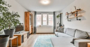
Cool and Warm Colors – Cool and warm colors are typically sued to create a mood in a room. Cool colors are blues, greens, and purples, while warm colors are reds, oranges, yellows, and pinks.
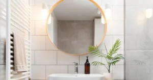
Non-Colors – Non-colors aren’t found on the color wheel, but still, play a very important role in interior design. Non-colors are the greys, beiges, browns, whites, and black.
Psychological Effects of Colors
Warm colors like red, yellow, orange are often associated with love, passion, anger, and happiness. Cool colors like blues and whites are associated with peace and tranquility and have a calming effect.
Blue:
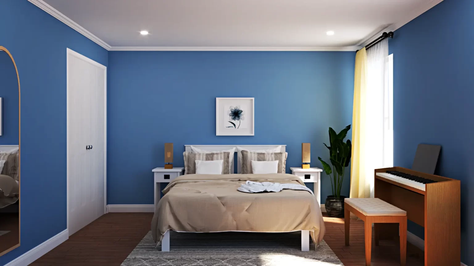
Blue is a tranquil color associated with serenity, peace, and calm. It is considered a sign of reliability and security and has a gentle effect, lowering blood pressure and reducing anxiety. In interiors, blue depicts visuals of the ocean and the sky.
Green:
Green is a dominant color that expresses abundance, peace, rest, and refreshment. It is a soothing color and can help uplift your mood. Used to visualize nature, and has a relaxing and youthful vibe.
White:
Innocence, purity, and completion — these are the words used to describe white psychologically as well as in interior design. White helps a space look large. The right shade of white can make a room look modern and stylish.
Yellow:
Proper use of yellow in interior design is crucial. Yellow can evoke feelings of dullness if not used sparingly. In color psychology, this color is considered both energetic, as well as negative. Yellow rooms can kindle negative feelings of frustration on people.
Contrast in Colors
Contrast, or opposition, is the arrangement of opposites of an element to create visual interest and drama. Colour contrast is the difference between one or more colours or colour values or intensities. Large variances or abrupt changes are described as ‘sharp’, ‘high’ or ‘vivid’ contrast; small variations are described as ‘low’ contrast.
Contrast in colour may involve using complementary colours which sit opposite one another on the colour wheel; or may involve value contrast – the placement of high-key colours (light values) adjacent to low-key colours (darker values), with no progression through the middle values between them.
Contrast adds interest and drama, offers relief from uniformity, emphasises the shapes of furnishings and can provide balance to a scheme. Contrast also makes a scheme more dynamic. Restraint in the variety of colour should be counter-poised by diversity and contrast in colour values or intensities, and in other elements such as texture, in order to provide interest.
I hope this blog helped you.
For more SketchUp tutorials you can check out https://sketchupguru.com/blog/
You can also check more tutorial videos for sketchup on our YouTube Channel,
https://www.youtube.com/c/SketchupGuru
To know about the Top Online 3D Rendering Courses for 2022 click,